This study presents a novel approach to analyze and visualize COVID-19 data in Russia using 3D plots and mathematical models. The Morgan-Mercer-Flodin model was the most fitting. The 3D contour plot visualizes long-term trends of COVID-19 waves from 2020 to 2023, revealing peaks and valleys of activity, and highlighting regions needing more interventions.
The coronavirus disease 2019 (COVID-19) pandemic has caused unprecedented health, social, and economic impacts worldwide [1]. As of January 14, 2022, there have been over 300 million confirmed cases and over 6 million deaths globally. The Russian Federation is one of the most affected countries, with over 10 million cases and over 800 thousand deaths [2]. Understanding the dynamics and trends of the COVID-19 epidemic in the Russian Federation is crucial for developing effective strategies and policies to mitigate its consequences. In this article, we present a novel approach to analyze and visualize the COVID-19 data in the Russian Federation using three-dimensional (3D) plots and mathematical models.
Three-dimensional (3D) plots were investigated to display the daily reported cases and deaths as a function of time and to show the correlation between morbidity and mortality [3]. Run charts were used to identify the patterns and behaviors of the epidemic, such as the number and duration of waves, the lag time between cases and deaths, and the mortality ratio [4]. Examination of different mathematical models were examined, such as the Morgan-Mercer-Flodin (MMF) model and the exponential association model, to fit the data of cumulative cases and deaths and to calculate the first-order derivatives to show the rate of change for each outbreak metric.
Comparison of the performance and accuracy of the models using various criteria was explored, such as the standard error, the correlation coefficient, and the tolerance fit convergence [5]. Discuss of the possible factors that may have influenced the COVID-19 trends in the Russian Federation, such as seasonal variations, virus mutations, testing capacity, vaccination coverage, and public health measures will be highlighted [6]. The main contribution of this article is to provide a comprehensive and intuitive overview of the COVID-19 situation in one of the most impacted European countries over three years using 3D plots and mathematical models. This approach can help to monitor and evaluate the impact of various strategies and policies on the pandemic outcomes and to identify the areas and periods where more interventions are needed.
Between January 3, 2020, and January 14, 2022, monitoring of daily reported cases and deaths is displayed as a three-dimensional interaction through two viewpoints in Figure 1 as well as the contour plot in Figure 2 to visualize the zones. The surface plot displays an embodied view, whereas the contour plot depicts a top view, visually associating morbidity and mortality and supporting the correlation conclusion [7]. In order to obtain an advantage for examining pattern and incident behavior, the 3D-chatting was divided into 2D-trending graphs using run charts. After 55 days of lag time, there are signs of six waves of fatality spiking connected to the same number of sickness flares that follow the first chronologically (Figure 2) [4]. There was an obvious declining trend of the daily mortality/morbidity ratio -expressed as a percent - in the graph. The rate of average deaths to the mean of the daily reported cases was 1.80%. There is evidence of an escalation in the disease magnitude each year.
Apart from cyclic function and polynomial fit, Morgan-Mercer-Flodin (MMF) model showed the most appropriate regression with low error [8]. This finding was applied to the logarithmically transformed Cumulative Cases (C.C.) versus Cumulative Deaths (C.D.) which was also subjected to the transformation. The same was found for the kinetics of C.D., while C.C. kinetics were followed three parameters-exponential association model fitting [9]. Table 1 details this finding statistically and mathematically with the standard equations shown. First-order derivatization was deduced to show the rate of change for each outbreak metric.
A three-dimensional contour plot was used to visualize the long-term trends of COVID-19 waves in the Russian Federation [10]. The plot shows the relationship between new cases, new deaths, and date reported from January 2020 to January 2023. The data reveals several peaks and valleys of COVID-19 activity, with the highest number of new cases and deaths occurring in the beginning of beginning of 2021 and 2022, because of the following possible reasons:
Seasonal variations: COVID-19 may have a seasonal pattern, with higher transmission rates in colder and drier months1. This could explain why the peaks coincide with the winter season in Russia.
Virus mutations: New variants of COVID-19 may have emerged and spread in Russia, increasing the infectivity and severity of the disease. This could explain why the peaks in 2021 and 2022 are higher than the previous ones.
Testing capacity: The number of confirmed cases depends on the availability and accessibility of testing. This could explain why the peaks and valleys do not reflect the true prevalence of COVID-19 in the population.
Vaccination coverage: The level of immunity in the population depends on the rate and effectiveness of vaccination. This could explain why the peaks and valleys may decrease over time as more people get vaccinated.
Public health measures: The implementation and adherence to preventive measures such as social distancing, mask wearing, and lockdowns may influence the transmission dynamics of COVID-19. This could explain why the peaks and valleys may vary depending on the policy responses and public behavior.
The visual analysis suggests that the COVID-19 pandemic in the Russian Federation has been characterized by multiple waves of varying intensity and duration. The factors that may have contributed to these waves include seasonal variations, virus mutations, testing capacity, vaccination coverage, and public health measures. The contour plot also highlights the regions and dates where the pandemic was most severe and where more interventions were needed.
The contour plot provides a comprehensive and intuitive overview of the COVID-19 situation in the Russian Federation over four years. It demonstrates the dynamic and complex nature of the pandemic and the challenges of controlling it. It also serves as a useful tool for monitoring and evaluating the impact of various strategies and policies on the pandemic outcomes.
One possible unique view and insight from the 3D graph in Figure 1 based on the given information is the lag effect. The figure reveals an intricate interplay between various factors that have influenced the COVID-19 trends in Russia. One unique insight could be the potential lag effect between peaks of new cases and subsequent increases in deaths, which isn't explicitly mentioned but can be inferred from the visual data. This lag could be attributed to the time it takes for the disease to progress and might vary depending on healthcare capacity, effectiveness of treatments, and other variables.
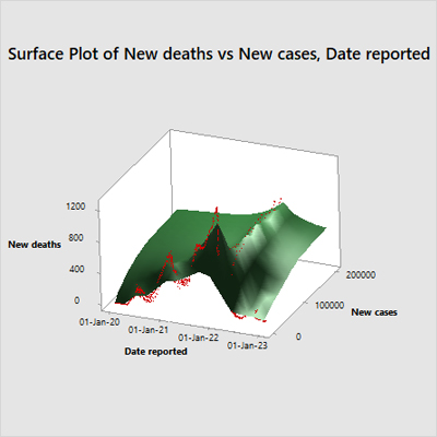
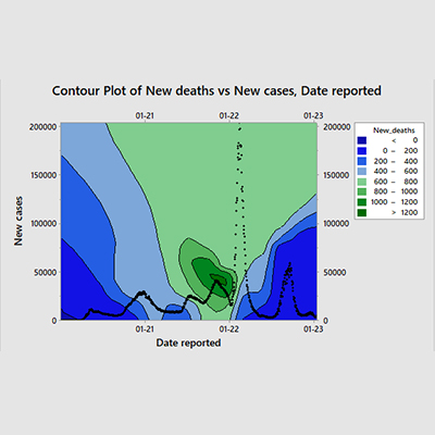
Figure 1: Three-dimensional view of the long-term monitoring of COVID-19 waves in Russian Federation
Time Series Analysis of Morbidities and Mortalities
Figure 2 (upper graph) is a time-series plot that illustrates the number of new cases and new deaths over a specific period. The x-axis represents the dates, while the y-axis represents the count of cases/deaths. Two lines, one blue representing new cases and one red representing new deaths, are plotted on the graph. The plot shows a significant spike in new cases around February 2022, reaching its peak before declining. New deaths remain relatively low throughout the period but show slight increases corresponding to peaks in new cases. There was a significant increase in emerging cases at a certain point during this period, which subsequently led to an increase in deaths, albeit not as pronounced. Monitoring and interventions need to be intensified during periods of rapid increases in new cases to mitigate subsequent rises in death rates.
Figure 2 (middle graph) is a time-series plot that chronicles the number of new deaths over a specific period, as indicated by the dates on the x-axis. The y-axis represents the count of new deaths. The plot shows an initial increase in deaths, reaching a peak before subsequently declining. There is noticeable volatility in death counts, with significant fluctuations observed. There was a period where the number of deaths increased sharply to reach a peak before it started to decline. This could be indicative of an outbreak or epidemic that was eventually brought under control. Understanding the factors that contributed to both the rapid increase and subsequent decline in death counts could be crucial for managing future outbreaks and minimizing fatalities.
Figure 2 (lower graph) is a time-series plot that illustrates the daily mortality ratio over a period of 1000 days. The mortality ratio is expressed as a percentage and fluctuates significantly throughout the observed period. The plot shows an initial increase in the daily mortality rate, reaching its peak around day 340 to 640 (approx. 200 days duration) before gradually declining. There are noticeable fluctuations, with significant peaks and troughs. A linear mortality rate line indicates a general decline over time. The overall trend, as indicated by the linear mortality rate, shows a decrease in the daily mortality ratio over time despite periodic spikes. This data could suggest that while there are periods of increased mortality, efforts or natural progressions leading to reductions are evident over extended periods.
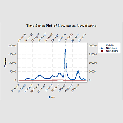
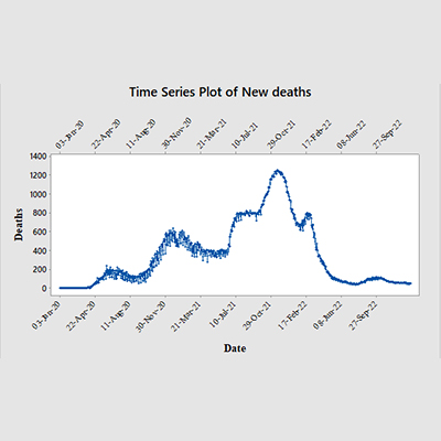
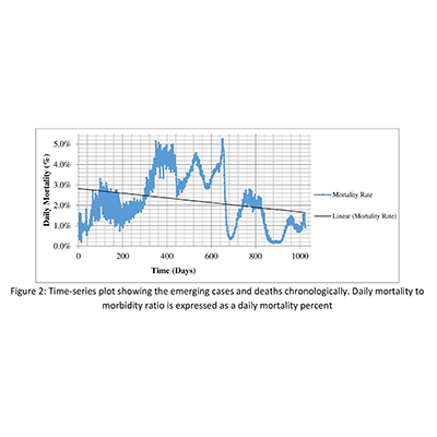
Figure 2: Time-series plot showing the emerging cases and deaths chronologically. Daily mortality to morbidity ratio is expressed as a daily mortality percent
Derivatization refers to the process of finding the first order derivative of a model equation with respect to a variable, such as time or cumulative cases. The first order derivative represents the rate of change of the dependent variable (such as cumulative deaths) with respect to the independent variable (such as cumulative cases or time). The first order derivative can be used to analyze the slope, curvature, and inflection points of the model equation, and to compare the fit and performance of different models.
In Table 1 three model equations are present that fit the data of COVID-19 cumulative cases and cumulative deaths in the Russian Federation. The table also shows the coefficient data, the standard error, the correlation coefficient, the tolerance fit convergence, and the weighting for each model. Calculation of the first order derivatives of each model equation were deduced from the equations in table. The first model equation is a Morgan-Mercer-Flodin (MMF) model, which is a four-parameter sigmoidal model that can describe the growth of an epidemic.
The second model equation is an exponential association model, which is a three-parameter model that can describe the exponential growth or decay of a phenomenon. The third model equation is another MMF model, which is similar to the first one, but with different variables and coefficients. To compare the results of the modeling, we can look at the standard error, the correlation coefficient, and the tolerance fit convergence for each model. The standard error measures the accuracy of the model fit, with lower values indicating better fit. The correlation coefficient measures the strength and direction of the relationship between the variables, with values closer to 1 or -1 indicating stronger correlation. The tolerance fit convergence measures the difference between the actual and predicted values of the dependent variable, with lower values indicating better convergence.
Based on these criteria, we can see that the first model (MMF model for cumulative deaths vs. cumulative cases) has the lowest standard error (0.0734328), the highest correlation coefficient (0.9988538), and the lowest tolerance fit convergence (1e-006 in 77 iterations). This suggests that this model has the best fit and performance among the three models. The second model (exponential association model for cumulative cases vs. time) has the highest standard error (0.3915856), the lowest correlation coefficient (0.9749574), and the highest tolerance fit convergence (1e-006 in 7 iterations). This suggests that this model has the worst fit and performance among the three models. The third model (MMF model for cumulative deaths vs. time) has a moderate standard error (0.2630424), a moderate correlation coefficient (0.9851919), and a moderate tolerance fit convergence (1e-006 in 48 iterations). This suggests that this model has a moderate fit and performance among the three models. Figure 3 demonstrates the time series relationship showing the actual and predicted curves for the transformed cumulative cases and deaths.
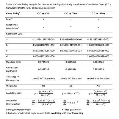


Figure 3: Non-linear curve fitting of the transformed Cumulative Cases (C.C.) using exponential association and Cumulative Deaths (C.D.) using Morgan-Mercer-Flodin (MMF) models

Mostafa Essam Eissa is an independent researcher specializing in Pharmaceutical Microbiology and Quality Control. He holds a Bachelor’s degree in Pharmaceutical Sciences from Cairo University. Eissa has published over 100 scientific articles and one book, with a focus on microbiological quality control, risk analysis, and statistical process control in the pharmaceutical industry.

